umans process a majority of the information we encounter through the light waves that enter our eyes.
Our brains turn those light waves into 2.8 million different colors that we use to help make sense of the world.
Understanding how these colors effect our perceptions of beauty, harmony, symmetry can help us become better knitters and designers.
In this post we’ll define terms like hue, chroma, and value. We’ll also explain the color wheel and how using contrast can improve your knitting.
[/background] [/col] [col span=”6″] [ux_banner bg=”http://elysium-creation.com/wp-content/uploads/2014/02/Seamless-Polygon-Backgrounds.jpg” height=”500px” text_width=”75%” text_color=”light” text_align=”center”]Things You’ll Learn In This Article
[divider] [/ux_banner] [/col] [/row] [background bg=”#eee” padding=”20px” parallax=”0″ dark=”false”]Who This Article Is Written For
- A knitter who wants to learn how to incorporate colorwork into their sweaters.
- A designer who wants a better understanding of the relationship between colors.
- A fiber artist who wants to begin dying yarn
[title text=”Why Is Color Theory Important?” style=”center”]
 One easy way to take your sweater knitting to the next level is to add color work.
This can be done using color changing yarns or stripes. You can also use color work techniques like fair isle, intarsia, or mosaic knitting.
In fact, choosing the colors for my projects is my favorite aspect of knitting. I love putting together simple or complex color palettes to make my sweaters look incredible! Just the other night I made five little piles of different colors to determine where my next project would take me.
For me, a tasteful mixture of colors is critical. It can make or break the project (which directly correlates with how often something gets worn). As knitters we don’t have to be limited to the colors of sweaters on the rack. Our only limitation is having to make a choice among the thousands of yarn colors available to us. The combinations are endless!
Even though the process can be exciting, choosing colors can be a little bit intimidating too. If you’re color wary then this post will be particularly helpful. We’ll get your toes wet in the world of color by breaking things down into a simple visual system.
If you’re bored with knitting the same colors or you have trouble matching colors together, you’re in the right place!
[title text=”What Is Color Theory?” style=”center”]
There are lots of areas that color theory addresses, but here’s a basic definition.
Color theory is a body of practical guidance to color mixing and the visual effects of a specific color combination. The goal is to create complementing, contrasting, and vibrant color schemes that are pleasing to the eye.
I think the key here is the phrase “pleasing to the eye”. There is nothing stopping you from combining any colors you like. But, by using the principles of color theory you can learn to choose colors that always look great together!
A Brief History of Color Theory
The foundations of color theory can be found as far back as the 1400’s. The writings of Leone Battista Alberti and Leonardo Di Vinci both contained studies of color. But, the traditional study of color did not begin until the 1700s when Sir Issac Newton created the first color wheel.
Since then there have been many scientific studies done on how we perceive color. Almost all contemporary explanations of color use a tool called a color wheel. Not all color wheels are the same. Some color wheels use different primary colors than others. But in the end all that really matters is that the color wheel presents it’s hues in a logical way.
[title text=”The Basics of Color Theory” style=”center”]
If our goal with color theory is to create pleasing color schemes then the concepts of complementation, contrast and vibrancy are how we execute that goal.
Complementation
Complementation refers to the way we see colors – specifically in terms of their relationships with other colors. When colors from opposite ends of the spectrum are paired together we consider them more appealing. They are called “complementary colors” because the eye is provided balance through the combination of these two opposites.
Basically, color theory is all about the relationships between colors. Our eyes look for balance between colors. Our brains find color schemes that are well balanced pleasing to look at. This balance relates directly to our perception of beauty. This article on Apartment Therapy does a great job of explaining why.
Contrast

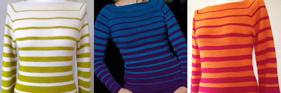
Contrast refers to a clear division of color elements in a project. At an optimal level of contrast your garment will be most pleasing to look at. In fact, it actually reduces eyestrain and allows the viewer to focus their attention better. I have found that if I’m working on a project with low contrast that after a while my eyes go crazy and it makes my head feel like exploding.
In the sweater on the left you can see an example of high contrast. The sweater in the center demonstrates a medium level of contrast. On the right the sweater has a low level of contrast.
Vibrancy
You may not realize it, but colors have the power to evoke a strong emotional response.
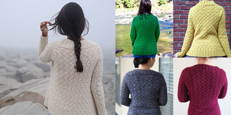
Look at this example of the Rocky Coast Cardigan by Hannah Fettig. What sorts of different emotions do you feel as you look at the sweater in creme? How about when you look at the green sweater? Yellow? Grey? Fuchsia?
Keep in mind what sort of emotions you want your sweater to evoke. Specifically keep in mind what you plan on doing in your sweater. If you’re hoping to make a sweater for lazy days at home, a vibrant orange might make it difficult for you to relax. A less vibrant hue might be a better option in this scenario.
[title text=”Color Theory Terminology” style=”center”]

Hue
In color theory, a hue refers to a pure color, that is, one without tint or shade. A hue is an element of the color wheel.
Saturation
Saturation, not to be confused with any of the previously mentioned elements, refers to the intensity/vividness of the color. Colors that are highly saturated are bold and rich, while those that are desaturated lack vibrancy.
For example, saturation could be the difference between wearing a navy blue sweater or a baby blue sweater. Both can actually be the same exact hue of blue but are just at different levels of saturation.
A fully desaturated color will be some tone of grey.
Value
Value relates to how dark or light something is. This is generally defined by a gradient moving from black to white.

Chroma
Chroma is defined by how dark or light a specific hue is.
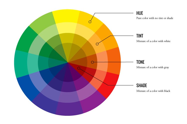
Tint
A tint is the mixture of a color with white, which increases lightness. In the picture, this is the second ring of the circle.
Tone
A tone is produced either by the mixture of a color with gray, or by both tinting and shading. This is represented by the third ring of the circle.
Shade
Finally, a shade is the mixture of a color with black, which reduces lightness. Shade is represented by the innermost ring of the circle. Now supposing you’re not in art class, the term “shade” can be generalized to encompass any varieties of a particular color, whether technically they are shades, tints, tones, or slightly different hues.
Mixing a color with any neutral color including black, gray and white reduces the colorfulness (aka chroma), while the hue remains unchanged.
Whew! Now that we’ve got that cleared up lets jump into the fun stuff!
[title text=”The Color Wheel” style=”center”]
Now lets talk about the most important tool in color theory, the color wheel. Understanding the color wheel will help you to choose colors that are balanced and harmonious! Once you have a grasp of how they work together the colors in your closet (and your stash) will start to jump out at you in a whole new way! Conveniently Spring and Summer garments hold a great deal of color possibilities, so you’ll have a chance to try out your new-found color theory chops as soon as you’re finished reading.
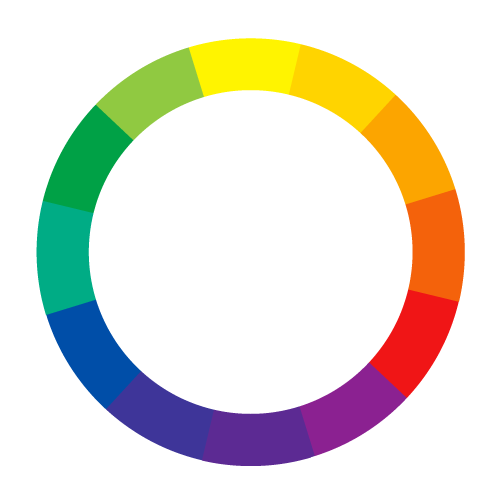
A color wheel (also referred to as a color circle) is a just a visual representation of colors arranged according to their chromatic relationship. In other words the color wheel is a way of organizing colors into a spectrum, and understanding how different colors relate to one another. In a color wheel the primary colors (red, yellow and blue) are equidistant from one another, then a bridge is created between the primary colors using the secondary and tertiary colors. Don’t worry if you’re not sure what the secondary and tertiary colors are yet, we’ll talk about that in a minute.
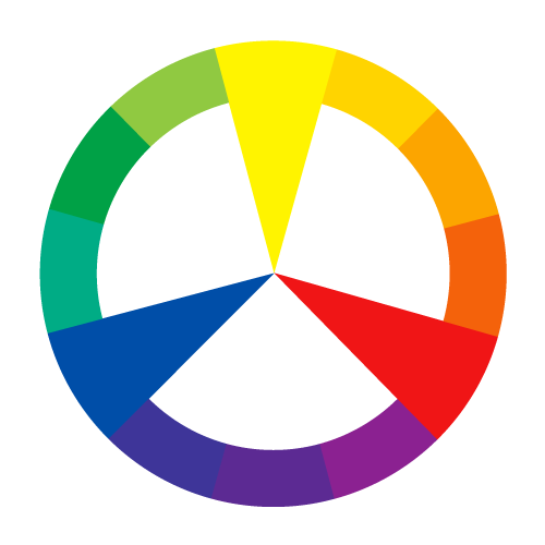
A color wheel displaying the primary colors; red, blue, and yellow
Primary Colors
Primary colors are the colors you got to play with in elementary school (red, yellow and blue). They are colors at their most basic; that is, those colors that cannot be created by mixing other colors together. Theoretically if you mix them equally you will end up with black. However, since in general we are not mixing the colors of our yarn like paint this is not really something to worry about.
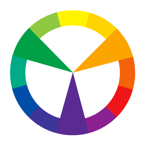
Secondary Colors
Secondary colors are the colors achieved by a mixing of two primary colors together. For example, if you mixed blue and yellow you would get the secondary color green.
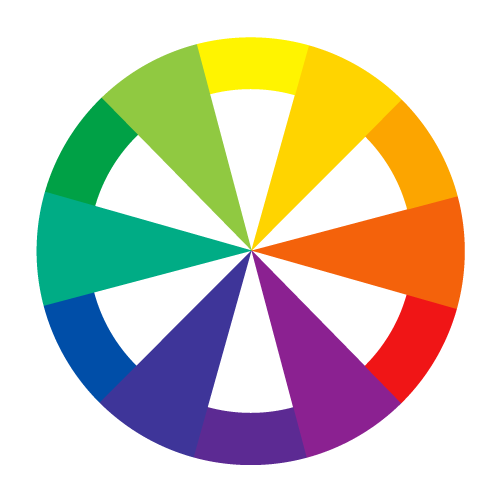
Tertiary Colors
Tertiary colors are achieved by a mixing a primary color and a secondary color. So you could mix the primary color yellow with the secondary color green and end up with the tertiary color yellow-green (or what I usually refer to as lime green).
[title text=”Color Temperature” style=”center”]
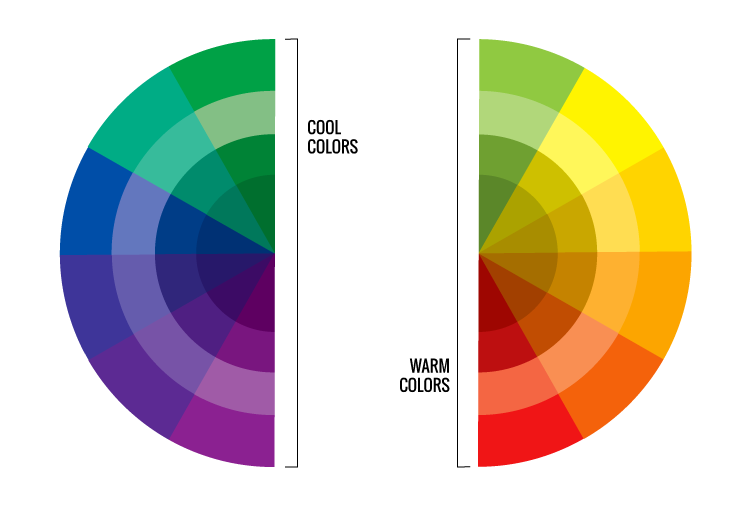
Cool Colors
Cool colors are all derived from shades of blue, also known as cool hues. The easiest way to remember what cool colors are, is to think of what colors would best illustrate a cool temperature such as greens, violets, light pinks, etcetera. Cool colors look wonderful on pale skin with pink undertones and with silver jewelry.
Warm Colors
Warm colors, the opposite of cool colors, are based around hues of reds, oranges, yellows, and so on. Warm colors look best on warmer skin tones and with gold jewelry.

Neutrals
Neutrals are colors that do not pop out or attract a lot of attention to the eye such as black, grey, beige, taupe, olive, and more. They literally go with everything and anything, and can be used to slowly add some color into your wardrobe by pairing bolder colors with them.
[title text=”Bringing it all together” style=”center”]
I know this article has covered a TON of information! Lets see if we can do a little recap.
An understanding of color theory is important for choosing tasteful color combinations for your next project.
Color study has been around for a long time but the big idea is just pairing colors in a way that is pleasing to look at.
Complementation, contrast and vibrancy are the main ways we can apply color theory to make projects that are visually pleasing.
If you want to sound incredibly well educated you can properly use the terms hue, saturation, value, chroma, tone, tint and shade when referring to the colors you’re using.
In regard to the color wheel you should now be able to point out the primary, secondary and tertiary colors (or at least have a good idea of how to find them).
Cool colors are derived from shades of blue. Warm colors are derived from shades of red. It’s pretty easy to see them if you split the color wheel down the center from green to red.
Finally, neutrals are those colors that don’t really draw attention to themselves but go well with all sorts of other colors. The big ones are black, grey, beige, taupe, olive and various shades of camel and brown.
That’s it. Now you’re basically a color theory pro!
What’s Next?
If you’d like to see how the using the color wheel translates directly into sweater knitting check out the next post in the series “Traditional Color Schemes: The Ultimate Guide to Color Theory For Sweater Knitters Part 2”. We’ll talk about some more in depth ways to use the color wheel to choose eye popping color schemes for your sweaters.
Comments on The Color Wheel: The Ultimate Guide to Color Theory For Sweater Knitters Part 1