In our previous series The Ultimate Guide to Color Theory for Sweater Knitters we looked briefly into seasonal color analysis and how it can work with the color wheel. Now we’re looking at each season a little bit deeper and including a few modifiers to be more specific within each season. Ultimately the goal is for you to find your absolute best colors! Once you have an idea of which colors look best on you it can be translated directly into your sweater knitting.
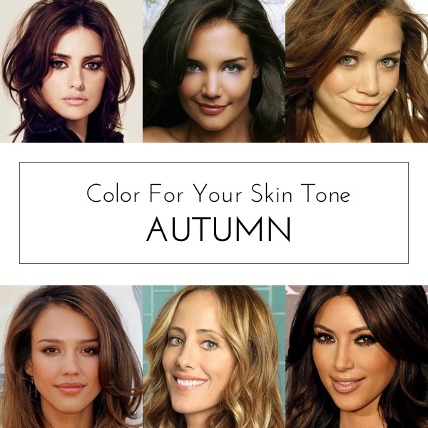
[title text=”Autumn Basics” style=”bold_center”]If you are an Autumn that means you have a warm skin tone and hair that is typically darker than medium brown.
You have a lot of depth to your coloring with golden undertones including a warm undertone to your skin. Bluish or pinkish tints may exist but the warmth is dominant. Peachy skin, which is a warm type of pink is considered warm.
You have a deep, earth tone quality to your eye color such as black-brown, deep to medium brown, bright brown, deep green, light to dark hazel, dark blue, mixed blue and green eyes (some gray or/and yellow in them).
In general, your coloring is low in contrast but not as delicate as Spring and Summer. Some Autumns have a high contrast coloring but not as vivid as a Winter.
A light, muted but rich coloring which appears mousy and a mix of both cool and warm tone might make you look neutral. But you still have some depth of color with an overall deep and warm look.
Within the overarching Autumn category there are three subcategories, warm, soft and deep. Each of these modifiers has one or two distinguishing features that hopefully will help you determine your very best colors!
[title text=”Warm Autumn” style=”bold_center”]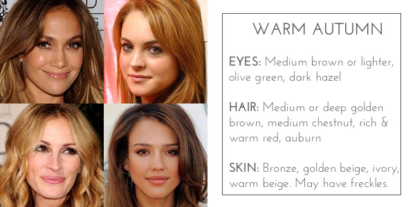
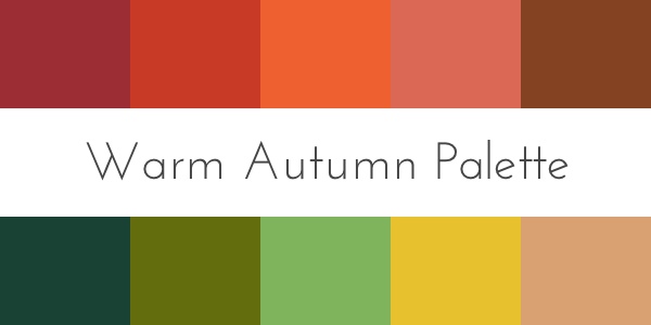
Warm Autumns look best in the classic colors one sees in autumn: fallen leaves of brown, yellow, and red; spicey nutmeg and pumpkin orange. As long as the colors are rich and warm, they will harmonize wonderfully with a warm autumn’s golden undertones. Keep the colors in the medium range–not too deep and not too light.
Warm Autumns are not blended with a cool season, but can blend into the Warm Spring season, so they can share some of the warmest colors of Spring in their palette.
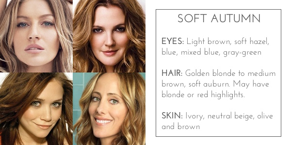
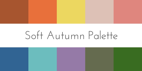
Soft Autumns need to wear only the most muted of the Autumn palette colors, the colors of the deep Autumn palette are too overpowering and the warm rich colors of the warm Autumn palette are too warm. Their coloring is quite neutral and they can wear soft colors from both the warm and cool colors but favor the warmer colors. Avoid bright colors which can look garish or clown like. Their coloring can often look a bit “mousy” and boring unless they wear their correct colors. The Soft Autumn is a blend of both Autumn and Summer, and their blend of both warm and cool will show up quite neutral-neither obviously warm or cool.
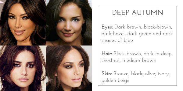
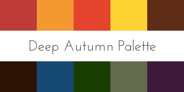
A Deep Autumn needs to wear the deepest and most vivid colors of the autumn palette. Rich dark chocolate, tomato red, pine green are a few of the colors that enrich your intense coloring. For maximum effect, pair dark colors with some of the brighter colors for contrast. Steer clear of soft pastels and light earth tones which are not strong enough for your coloring and will wash you out. A Deep Autumn is a blend of both Autumn and Winter, and their coloring will be more slightly more neutral than a warm Autumn season.
Use Your Colors As A Guide, Not A Rule
You should not rely on your colors like a fail-proof rule for every color that looks good on you. Why not? Because the 12 seasonal sub-types are not exclusive nor comprehensive. That means that you might not neatly fit into only one type and be suited to only one color palette.
If your complexion does fit one of the types well, it would be a huge shame to just ignore the all the other colors . The other palettes, especially your within your season offer a whole host of other shades to explore that will suit you just as well. Using the other palettes can help you build a more varied, yet still cohesive color schemes for your knitting needs. Use your recommended color palette as a starting point and work from there to experiment with additional colors tones and shades.
Personal Preference Trumps Color Analysis
Your color palette should never restrict your ability to express your aesthetic preference through your knitting. If your recommended colors do not match your style concept, just analyze each shade individually and decide if you can pull it off. Using the process of elimination you can begin to build a very personal color palette for yourself. If a certain shade makes you look sickly try to find a replacement that still captures the color’s essence but fits your skin’s undertone a little better.
If a colour does not look amazing but also not horrible on you, then I say go for it! I’m a warm Spring so black is definitely not one of my best colours, but I love it! Instead of the super saturated dark black I usually go for a softer grey or charcoal (and they also happen to be easier to see when I’m knitting).
Prioritize Colors Close To Your Face
The whole point of color analysis is to find colours that flatter your skin tone, hair and eye colour, in other words your face. Colors that are not in near your face might have an impact on the overall look of your sweater, but not on your complexion. As you’re planning out your next sweater project try to put colors from your recommended palette near your face. If there is a color that you love that isn’t within your palette go ahead and use it, but try using it for details or in a lower part of the sweater far from your face. For more about colors and neutrals that look great together check out these articles in our color theory series!
Traditional Color Combinations
Combining Colors and Neutrals
As you’re reading this you may discover that you’re not an Autumn at all. If that’s the case don’t worry! Check out our other posts for Spring, Summer and Winter.